Industry
eCommerce
Client
Plaza Vea
UX Research Study For Plaza Vea
The leading supermarket chain sought to enhance the user experience on their website.
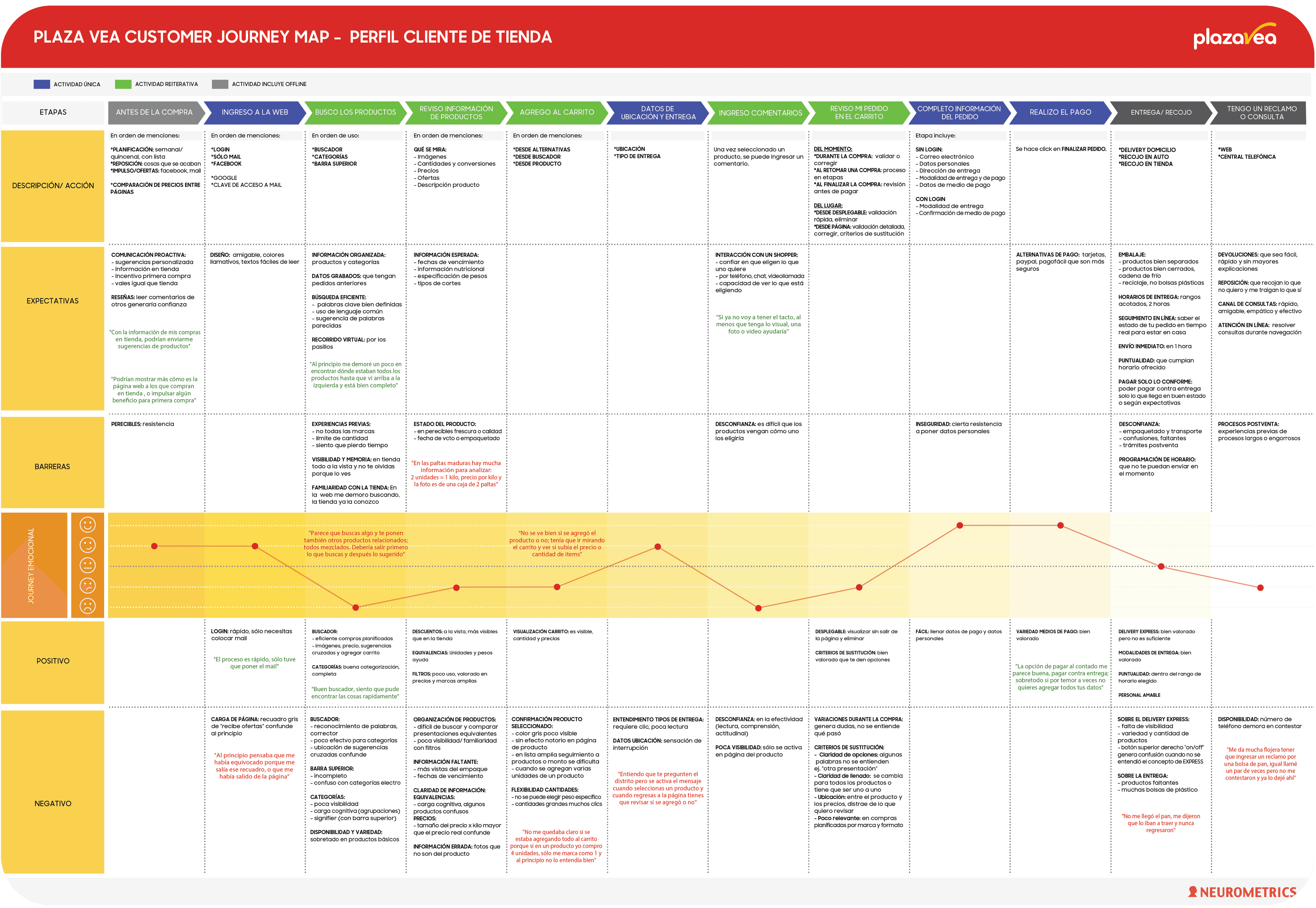
Through a comprehensive analysis, the company sought to identify and improve features related to navigation, browsing, and checkout processes for an enhanced and seamless online shopping experience. My role was to conduct qualitative and quantitative user research methods among my team to collect real user information. Additionally, I was in charge of creating the design systems for our client document delivery, highlighting the customer journey maps designs
Roles
UX Researcher Visual Designer
Duration
01/2019 - 03/2019
Practices
Survey Design Interviews User Testing Graphic Design
Goal
To understand what the current online buying experience was for users and how it could be improved.
Overview
Subjects of Study
1. P.V. Online Customers:
N° of People: 14 Genders: 6 M, 8 F Age Range: 25-55
2. P.V. In-Store Customers


Execution
Steps followed on Participants’ Grocery Shopping
1. Before Purchase (Planning) 2. Web Entry 3. Product Search 4. Visualization Of Product Information 5. Add To Cart 6. Location And Delivery Information
7. Comment Section 8. Order Review 9. Complete the Order’s Information 10. Purchase 11. Complaint Or Query (After Purchase)
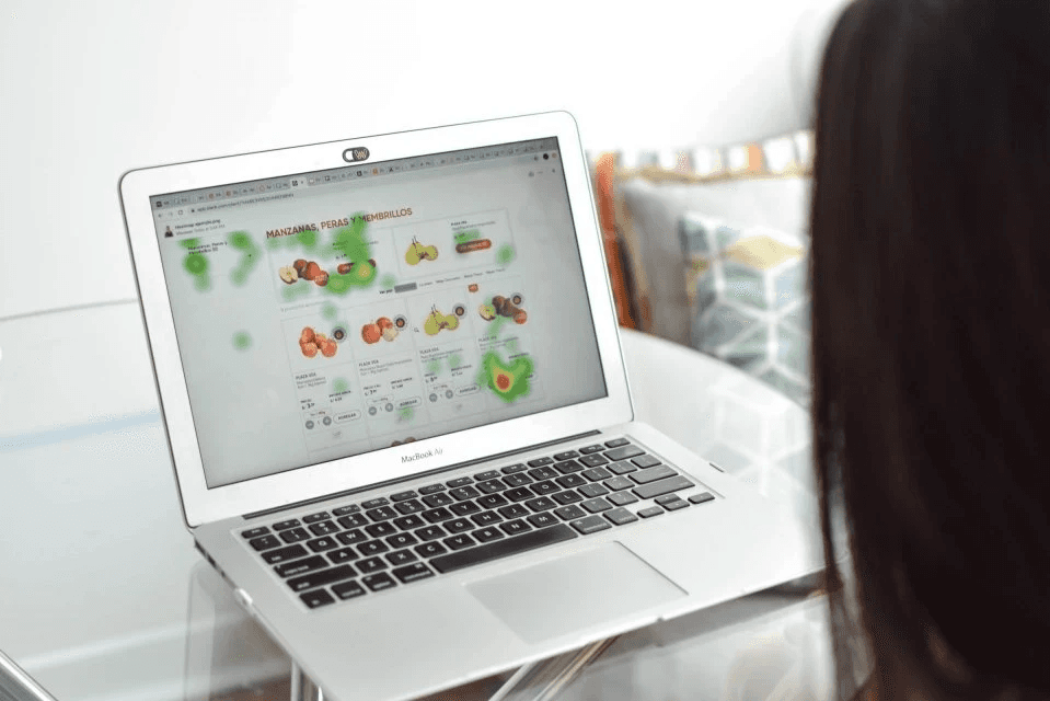
Their visual journey was documented with eyetrackers, and their comments and concerns were noted throughout this process. To gain deeper insights, we conducted interviews at the conclusion of the study, allowing participants to elaborate on specific aspects of their experience during their interaction with the website. Two main customer journey maps were created, one for in-store customers and other for online customers and they encompassed key components such as: Description/Action, Expectations, Barriers, Emotional Journey and Positive/ Negative Valuations. With these documents we were better able to understand what the customers engage with identify pain points such as miscommunications in the page, errors in the search bar and difficulties for the user in editing product units inside the cart.

Conclusion
On the positive front, the convenience of planned purchases, efficient search functionalities, and a seamless checkout process stand out as pillars of satisfaction. However, challenges in customer support responsiveness, confusion in certain interface elements, and the need for improvements in product information clarity present areas for enhancement. Striking a balance between these facets will be pivotal in crafting a digital shopping experience that not only meets but exceeds user expectations, fostering sustained loyalty and engagement.
Key Takeaways
Positive Aspects of Online Shopping Journey:
In the realm of online grocery shopping, positive experiences abound. Customers revel in the convenience of planned, non-perishable purchases without queues, motivated by accessible offers via Facebook or email.
The streamlined process, facilitated by Facebook login, removes the hassle of password memorization. Efficient product searches, aided by images and cross-suggestions, complement improved visibility through the top bar. Categories simulate the in-store experience, and previous purchases streamline navigation. Product selection benefits from relevant information, well-regarded filters, and quick additions facilitated by images. The purchase process stands out with convenient delivery options, a variety of payment methods, and timely tracking, contributing to an overall positive shopping journey.
Opportunities of Improvement:
Ineffective product searches, particularly for certain categories, and an incomplete top bar contribute to navigation issues. Limited availability and variety, especially in basic products, present obstacles during product selection.
"It wasn't clear to me if I was adding everything to the cart. When I added 4 units of a product, it only showed as 1, and initially, I didn't understand it well.” - Ana, 49 (F)
Ambiguous product details, including insufficient views and expiration dates, add complexity. The checkout process faces challenges such as confusing information, ineffective confirmation visuals, and concerns about product variations and substitutions, affecting the overall user experience negatively. Moreover, slow responses from customer service add confusion and distraught.

