Industry
Construction
Client
Jebens GmbH
Steel Construction Company Web Redesign
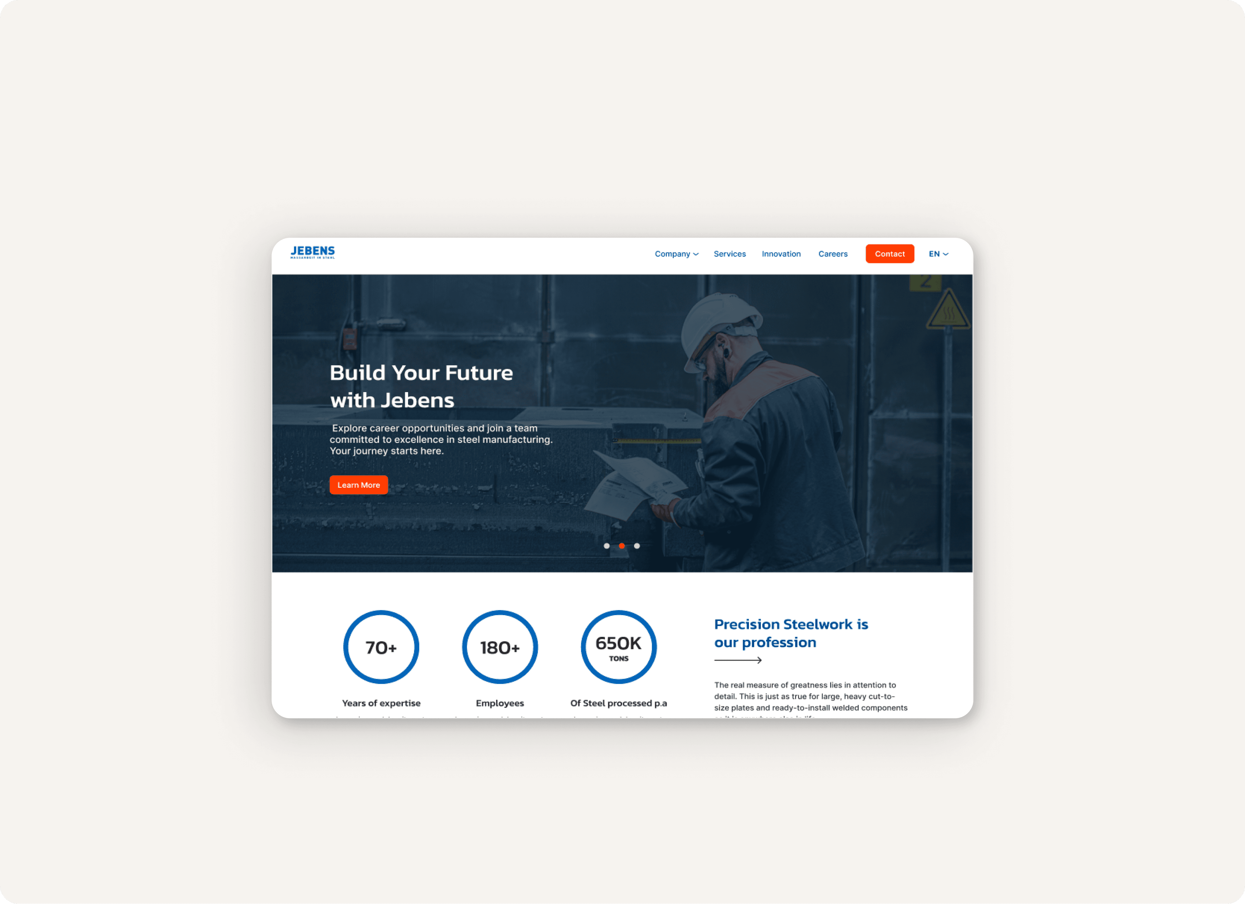
Jebens GmbH sought a web redesign to attract customers and streamline recruitment, enhancing both digital presence and customer engagement.
I was tasked to redesign Jebens' website to enhance user experience, streamline navigation, and showcase their offerings. The focus on the user experience and brand revitalization included dynamic visuals, an updated color palette, and improved navigation.
Roles
UX/UI Designer
Duration
11/2023 - 12/2023
Practices
Information Architecture Wireframing Human-Centered Design Methods Branding
Goal
Enhance user experience through impactful branding, engage users with visual storytelling, introduce dynamic elements like vertical scrolling and collapsible sections to break monotony. Optimize content arrangement and enrich the site with new pages (Press, Newsletter, Innovation, Careers) to showcase diverse offerings.
Target Audience
Customers
1. Existing customer
Purchasing manager mechanical engr., (M) 45yrs
2. Inexperienced new customer
Buyer in shipbuilding company, (M)
3. Experienced new customer
Buyer in mechanical engr. company, (M) 51yrs
Job Candidates
1. Trainee/student
Training for machine and plant operator, (M) 18yrs
2. Experienced skilled worker
Shift leader welding, (M) 45yrs
3. Non-industry freight employee
Junior technical buyer, (M) 27yrs
Design Criteria

Sitemap
New content pages such as the Home Page, Innovation and Careers page, needed to be designed and implemented. Each page was designed to enhance user engagement and provide a seamless browsing experience. The sitemap below organizes the order of these pages and the relations between them.

UX Redesign
The original Jebens site had many user experience issues: - Unclear information hierarchy - Lack of prioritization in primary interactions. - Lack of headings/ bullet lists. - Missing visual storytelling elements: images and graphics. - Lack of interactivity: monotonous feel. - Lack of vertical scrolling and collapsible sections. - Absence of interrelation and links between pages. - Absence of a footer section. After going over all the issues with the client, I started mocking up the design solution for the Jebens website.
Visual Design
Embarking on the journey to reshape the visual landscape of the Jebens website, a design system was crafted and structural updates involved creating a header, footer and main page layouts, merging content for improved cohesion, expand the color scheme, and utilizing images to reinforce the brand's employer image. The resultant main look and feel of the website were carefully crafted, featuring the content distribution for improved readability, the establishment of a clear visual hierarchy, and the seamless navigation experience.

Key Changes
1. Structural Updates:
- Header and main page structures were modified for clarity and simplicity. - Pages like 'Quality & Certifications' were merged for better alignment and ease of navigation. - Introduction of a 'Careers' page to streamline recruitment and strengthen employer branding.
2. Color Scheme:
- Blue and orange were chosen for their associations with trust, reliability, and professionalism. - The blue instills confidence in product quality, while the orange adds vibrancy and contrast.
3. Typefaces:
- Kanit and Inter fonts were selected for a cohesive and professional appearance. - Kanit for headers aligns with the brand's identity, while Inter for content ensures readability.
4. Main Look and Feel:
- Navigation bar addition for clear pathways and efficient exploration. - Content distribution for improved readability and enhanced user experience. - Use of orange for visual hierarchy, creating a vibrant and impactful design.

Design System
To ensure the components are implemented consistently across the site, I created a UI guide with details on color palettes, typography, and reusable UI elements.

Design Status
While still in development, this redesign promises a revitalization of Jebens' online presence, offering an engaging and user-friendly platform. With the integration of dynamic visuals, a modern color scheme, and improved navigation, it aims to deliver a compelling digital experience for users.

